
The Challenge
An emergency department generates a great deal of operational data and very little usable insight. Wait times, admission rates, referral patterns, and demographic mix all sit in the patient system, but answering a question as basic as "which hours are we understaffed" means somebody exporting spreadsheets and rebuilding the same analysis every month.
The brief was to replace that cycle with something a manager opens instead of requests.
What We Built
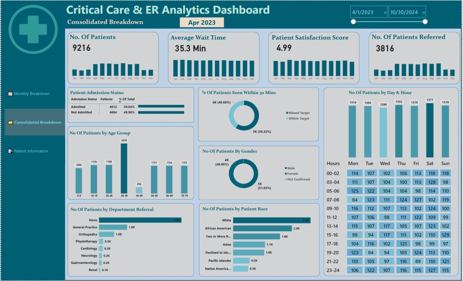
- Three linked report views: a monthly breakdown for the current period, a consolidated view across the full date range, and a patient-level table for drill-down
- Four headline measures carried across every view: patient volume, average wait time, satisfaction score, and referral count, each with its own trend sparkline
- A day-and-hour heatmap showing arrival volume by weekday and two-hour block, which is the view that actually drives staffing decisions
- Target tracking on the 30-minute seen-by threshold, split into within-target and missed-target so the gap is a number rather than an impression
- Breakdowns by age band, gender, patient race, and department referral, so demographic and routing patterns are visible without a separate report
- Month and year slicers plus a date-range control, so the same report answers both "last month" and "since we opened"
Technical Highlights
Power BISQL data modellingDAX measuresTime intelligenceDrill-through pagesSlicers and cross-filtering
What the Data Showed
- 9,216 patient visits across the reporting period, split almost exactly evenly between admitted (50.04%) and not admitted (49.96%)
- Average wait time held at 35.3 minutes, with 59.32% of patients seen inside the 30-minute target and roughly four in ten missing it
- Arrival volume is far flatter across the week than staffing usually assumes, sitting between 1,260 and 1,377 patients on every day including weekends
- The 30 to 39 age band is the single largest group by a wide margin, at more than double most neighbouring bands
- Over half of all patients arrive with no department referral, which reframes the referral pathway as a much smaller channel than expected
Why It Worked
The measures were chosen for the decisions they support rather than for how many charts they could fill. Average wait time on its own is a vanity number, so it sits next to the percentage seen inside the target, which is the figure that has consequences. The day-and-hour heatmap earns its space because it changes a rota.
The same discipline runs through our healthcare web work: report on the thing that causes a decision, not the thing that is easiest to count.
Want Reporting Like This?
Tell us what you need to see and we will scope the data work behind it, with no obligation.
Get a free quote See more work